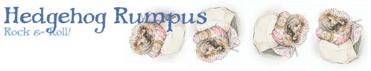
Okay, since I am laid up with a bum foot, I have lots of time to 'jazz up' the Rules website. I have designed a title pic that will be on the page, but I wanted input as it is going to be a group page.
Do you like it?
No?
What don't you like?
Too much color? (or not enough? hey, some people like color)
Too wispy?
Don't like the clouds?
Don't like the rainbow lettering?
Don't like the font?
Let me know what you think. I can take it. I've got lots of time and resources and the only other thing I might be doing right now is a counted cross stich my Mom sent me.

Subscribe to:
Post Comments (Atom)


3 comments:
Oooh, me likes. I like how it's so airy and fancy and colorful, somehow defying the actual words that are spelled out. An oxymoron print, if you will. Nice work!
Looks sehr gut, schwester. I'm emailing you things.
I'm glad you didn't use some Goth Kid font, although I think those are hilarious. Works for me, Susie. And I'm picky. (Just ask the other hedgehogs.)
Post a Comment